Stamen Map Tiles now a paid service

Understandably, the awesome map tiles produced by Stamen Design over 10 years ago have been moved to Stadia and are now a paid service. I have extensively used the Toner Labels service as annotation to aerial photography and as a base map for plotting point features. The projected cost of migration was too great. Over a recent 30 day period, I had approximately 70 million hits to CloudFront endpoint that serves up both GeoJSON parcels and proxied aerial photography. Assuming an even split between the two (each map request gets both parcels and imagery), that’s 35 million requests I would likely make to Stadia. This would likely be approximately $400 per month in additional charges to operate.

When I first received notice back in July, I started to look into a simple, straightforward replacement that I could produce in-house and self host. I also wanted to explore updating the map, as the Stamen-hosted tiles rarely (if ever) received an update with changes from OpenStreetMap. And while I liked Toner, I wanted to see if I could make some minor tweaks to it for my purposes.

New Toner-like labels in place.

Exploring My Options

I looked around at other platforms for rendering raster tiles, and they either were deprecated or functionally dead. I really liked TileMill back in the day and hoped to recreate the look of Toner using that platform, but getting it working in 2023 seemed like too much of a hassle.

One big challenge was getting the look and feel down before throwing a style file to a tile server and having it render a bunch of tiles. OpenMapTiles looked promising and featured a variety of styles that you could choose from, however just getting the rendering to switch styles was a headache and there are issues in the repo highlighting how it’s not straightforward.

I knew that I could come up with a suitable map for tiling using QGIS, so I looked into options exporting the styles from QGIS into a format that would work with a raster map tiler or a system like Geoserver. But seeing that QGIS has a server option, going that route would reduce the likelihood of losing something in translation.

Continue reading
Posted in Data, Tools and Scripts, Web Mapping | Tagged , , , , , | Comments Off on Stamen Map Tiles now a paid service

Broken libraries? Docker to the rescue!

I’m working on some spatial data, loading shapefiles into PostgreSQL on an older server of mine. Revisiting my previous blog post, I wanted to review more recent NJ Land Use/Land Cover data with the 2002 LULC data I imported to OpenStreetMap. Looking for changes between 2002 and 2012 can highlight areas of new construction, farmland loss, or reforestation that could then be updated in OSM. To do this analysis, I wanted the LULC data for both years as tables in PostgreSQL so I can perform some intersections and identify areas that have changed.

When I tried running ogr2ogr, I received an odd error.

ogr2ogr: /usr/pgsql-10/lib/libpq.so.5: no version information available (required by /lib64/libgdal.so.29)
ogr2ogr: symbol lookup error: /lib64/libgdal.so.29: undefined symbol: GEOSMakeValid_r

Having recently made some changes to this server, I assumed I broke some linked libraries. Instead of going down a rabbit hole trying to fix that, I decided to use Docker to run ogr2ogr (and ogrinfo) to review and export the shapefiles to PostgreSQL. On Docker Hub, there’s a osgeo/gdal image that will provide the GDAL/OGR tools, with the necessary PostgreSQL support.

Normally, running ogr2ogr to export a shapefile to PostGIS is like so:

ogr2ogr -f PostgreSQL PG:"host=postgresql dbname=my_database user=dba password=$PGPASS" -nln my_new_table origin_data.shp

Where the quoted string starting with PG: is the connection string info, -nln is the “new layer name” (or in this case, table name) and finally, the input shapefile.

We will need to pass all of that information in the call to Docker so that the command will run inside the container. Additionally, because our files are not inside the container – it’s just the GDAL/OGR environment – we will need to map a volume that’s accessible within the container.

Here’s the complete command and we’ll break down each step:

Continue reading
Posted in Data, PostgreSQL, Tools and Scripts | Tagged , , , | Comments Off on Broken libraries? Docker to the rescue!

Revisiting OpenStreetMap Land Use Data

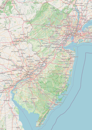
Screenshot of OpenStreetMap.org centered on New Jersey showing the default map style. The imported land use is very visible.
Statewide land use clearly visible. Source: OSM.

Back in August of 2009, I converted the latest available Land Use/Land Cover data for New Jersey into .OSM format and uploaded it as “NJDataUploads” to OpenStreetMap. You can read my write up of the initial uploading effort here.

While cleaning up old files, I revisited the code I had written and how I had exported the data out in “chunks” bounded by major highways. Using the old “arcgisscripting” library (the predecessor to ArcPy) I walked over the features and manually mashed together an XML file for use in a tool like JOSM. It was a great experience and I think I was able to contribute a bit to having New Jersey appear much more detailed and colorful in the earlier years of OSM, but the code and process could be so much more refined if written today. Nonetheless, the code worked and contributed (what I believe to be) the second large data import for New Jersey, after the initial loading of US Census Bureau TIGER data.

In the 12 years since I uploaded the land use data to OSM, how has it fared? Here’s a quick rundown.

In 2009, 57,894 polygons were uploaded in 76 different groups. OpenStreetMap does not have a data element of “polygon,” instead an enclosed area is one or more ways forming a loop. In order to perform this import, each polygon would need to become a way, but there are some caveats. As polygons have interior rings or very long exterior rings, sometimes you would need to have more than one way representing the polygon. I ultimately uploaded 68,430 ways. I also needed to create 2,600 multipolygon relations to properly show the land use polygons uploaded.

In 2021, oddly enough, there are actually 58,942 polygons – an increase of 1,048 – within New Jersey that have the “source=NJ2002LULC” key. This is likely due to updates over time where the original polygons were split up as modifications were made by other map editors.

31,400 of the land use polygons originally uploaded have not been modified. Still version 1.

There have been some interesting contributions to the Land Use data.

I spied a “landuse=?” tag within the data. What would have resulted in someone adding a landuse tag to a way with a question mark? The way in question is 41061328 and it’s the “inner” part of the multipolygon relation 254817. This should probably get cleaned up at some point.

A more productive set of edits were made on 39834766, where a generic “landuse=recreation_ground” was edited 9 times to updated the way to landuse=winter_sports” and to include the name, URL, and wikidata entry.

Way 39830330 was modified 11 times over 11 years, seemingly by the same user, switching it between “commercial” and “industrial” a few times.

Way 39848488 was modified 12 times as development occurred around it, refining the boundaries of the farmland polygon.

The “industrial” way (40136383) around one of the terminals in Bayonne was modified 20 times. It’s tied with this urban stretch of the Passaic River (40137094) for having the most versions of any of the data I updated back in 2009.

I’m still very proud of this effort and will be exploring some other ways I can use the land use data (and its later editions) to help update OpenStreetMap.

Posted in Uncategorized | Tagged , , , , | Comments Off on Revisiting OpenStreetMap Land Use Data

What a year.

I neglected to blog in 2020. I think I can speak for everyone when I say last year was “a wild ride” at best and a “disease and insurrection hellscape” at worst.

Last year, with the shift to remote, I got more involved in gardening at home. I installed a weather station on my shed and struggled in getting a 10+ year old USB weather station working with a Raspberry Pi. I installed a full-size rack in my basement and bought some servers to explore virtualization more. I did a lot of walking and ended up getting a touring bicycle.

This year, I’m planning on doing some longer bike rides, recorded with a bike computer I’ll be building. I’m working on some more side projects, and will likely blog about some of my work projects; both the successes and failures.

If by any measure you’re reading this and not following me on Twitter (mostly angry snark) or Instagram (mostly aesthetics) you can do so there for more frequent updates. In any case, this blog is not dead, just overdue for an update.

Posted in Uncategorized | Comments Off on What a year.

Pi-based LED Sign

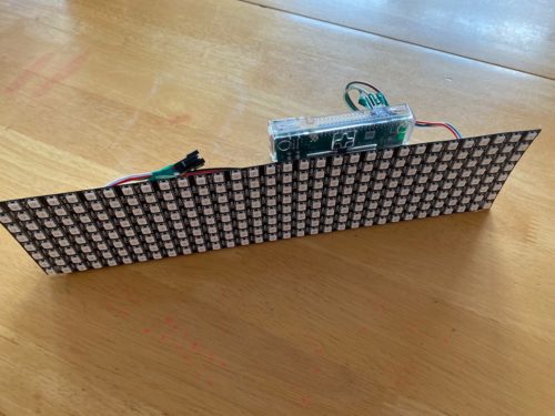
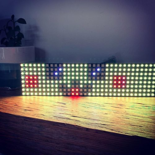
I took some time this Thanksgiving break to work with Raspberry Pi and a flexible LED display. I love the Pi, as it is a familiar environment, but with opportunities to work with different hardware.

Working with some instructions online, I was able to get the board up and running quickly.

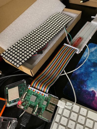
Wired up via breadboard
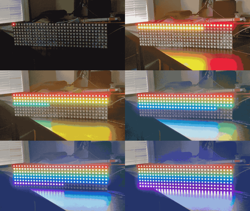
Lighting up in sequence with random colors.
Note that the way the LEDs fill in sequentially, which does not map to an XY grid.

You’ll notice above that the LEDs are filled in top-down, then bottom-up. This is because the LEDs are arranged in series, producing a serpentine pattern. In order to display images easily, I’ll need to map those IDs to an XY grid. I’ll get to that more in the Software section below.

Hardware and Mounting

After thinking about how I could mount the flexible, I settled on a flat, length-wise orientation. I initially thought about mounting it curved in a half-circle, so that part of the display could be viewable from multiple orientations. I knew I wanted to mount the sign on the wall, but having it stick out away from the wall was not ideal for my home. I then looked into mounting the display in a way that only the display (and power cord) is visible when mounted to the wall.

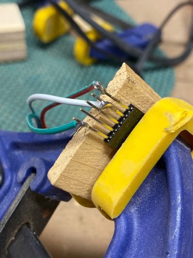
After finding some great resources online to work with WS2182B LEDs and Raspberry Pis, I first started with a breadboard to make sure I had the wiring correct. I then started to connect up to a Raspberry Pi Zero, but I realized (thankfully before soldering) that my Pi Zero was a 1.3, not a Pi Zero W. For now, I’ll use a Model 3B+ until a Zero W is delivered. In the interim, I soldered the sign’s three leads to a 5 pin molex connector so that I can simply slide it on to the GPIO pins.

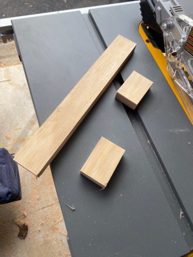
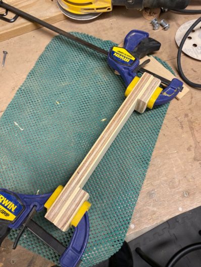
Looking at the backside of the display, the wiring was soldered in at approximately 5/6cm from the other edge. I had some birch plywood around from a previous project. I ripped it down to 4cm wide and then cut it into three pieces, one 30cm and two 6cm. I then glued the two 6cm pieces to the 30cm piece to the longer piece. I then used some heavy double-sided tape to affix the display to the wood. As I wouldn’t be directly soldering to the Zero W at this point, the GPIO pins are closely grouped, so I wired up the display connector to a small molex connector and connected the board to the LEDs.

Software

Code accompanying this write-up is available here: https://github.com/johnjreiser/pisign

One issue I encountered is that the LEDs are identified in series. I needed to make a translation between a 32-wide by 8-high matrix to
an individual LED’s ID. I put together matrix.py to build the array that would map to the LEDs. After building the matrix, I can then map a list of lists in Python (my XY grid) to the display.

Displaying a rainbow sequentially 
(x then y)
Now the LEDs are lighting left-to-right, top-to-bottom instead of serpentine from bottom-right.

Using the rpi_ws281x module, I put together a few demos of what can be done. I’m sure that they are not the most efficient or elegant code, but they will hopefully give you some ideas for your own projects. Feel free to open an issue on GitHub or submit a pull request if you make changes to the demos.

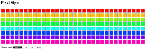
One item in the repo is a quick and dirty web application using Flask. It allows someone to view what’s displayed on the LEDs and manipulate it. My family has gotten pretty adept at making some cool designs with the sign while I’ve been away:

This was a fun one-day project and it spurred a lot of other ideas. Pushing alerts from the home automation software out to the occupants is one idea. A ticker with time and weather is one common offering. What would you put on your sign?

Posted in Uncategorized | Tagged , | Comments Off on Pi-based LED Sign

Meandering Meetings and Open Data

I love meetings. When the right people are in the room, with a clear agenda and desire to work together towards a common goal, magic can happen. Ideas are put out there and refined as a group, and an action plan is developed, with next steps and clear accountability. They end 5 minutes early and everyone leaves ready to tackle big problems.


Of course, this rarely happens. We spend a ridiculous amount of time in meetings that meander through a rough (or non-existent) agenda, no direction given nor accountability assigned, and then we depart to the next meeting feeling demoralized.

I am an employee at a public University. My colleagues and I have a responsibility to not spend taxpayer money and students’ tuition and fees inappropriately. I wanted a way to display a rough estimate of the cost of a meeting, to help remind us to keep focus and make progress.

New Jersey, with its strong freedom of information law (the Open Public Records Act, or OPRA) has salary information for all State Agency and Authority employees that is available on YourMoney.nj.gov. Also available are records containing information on those non-State Government employees contributing to public retirement systems, such as local government employees and educators. I have compiled this information and built a clock that will track time in dollars, based on the members in the meeting.

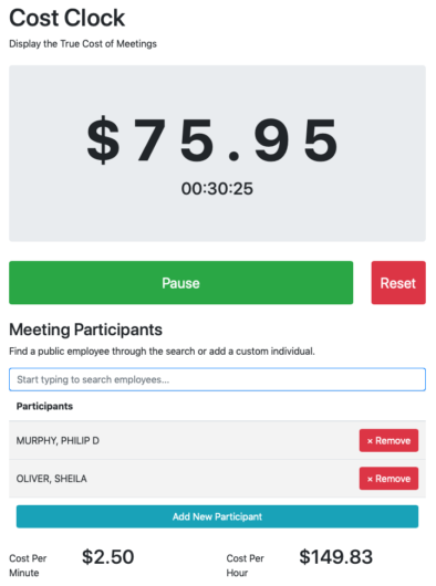
CostClock.com will allow you track a meetings cost based on the participants in the meeting. You can quickly add individuals from a list of public employees. If you are tracking a meeting of individuals not in the list of public employees, simply click “Add New Participant” and enter the person’s name (or title) along with annual salary or hourly rate.

As it is a clock, the amount and time are displayed prominently at the top of the page. I also wanted to reduce the navel-gazing that may be introduced with showing annual salaries, so only the total cost of the participants is displayed, per minute and per hour.

And while I’ve been mentioning the dollar amount as a “cost” costs aren’t necessarily a negative concept. An hour long meeting with several participants might yield a large dollar amount, but if it was productive and brings focus to the group, then that “cost” becomes a well-made investment.

I’m hoping that this can get some use within New Jersey and that others may adapt it and use it for their own meetings. I’m going to follow up this post with a technical explanation of my development and deployment workflow. If you’d like a copy of the code, head over to Github where you can use the code as you see fit.

Posted in Data, Government, OPRA, Privacy, Technology, Visualization | Tagged , , , | Comments Off on Meandering Meetings and Open Data

Presentations at MAC URISA 2018

I’m currently down at the MAC URISA 2018 conference in Atlantic City. This year, I conducted a full-day workshop on Spatial SQL. I also presented on using Docker to explore open source GIS offerings. If you’re still around at the conference and interested in what I presented above, let me know and I’d be happy to discuss! If you can’t make it to MAC URISA and are curious about databases and software deployment strategies, feel free to comment here or message me on Twitter.

Posted in Conferences, PostgreSQL, Teaching, Technology, Tools and Scripts | Comments Off on Presentations at MAC URISA 2018

What I’m Reading – July 2018

Here are a few articles I’ve read over the last month that you might find interesting.

“I keep it because I have not heard a voice I like better,” he once said, “and because I have identified with it.” He could change to a smoother voice, but then he wouldn’t sound like himself.

The Quest to Save Stephen Hawking’s Voice
Recreating Hawking’s hardware voice in software.


… of a production run of 10,000 transistors for example maybe 2-3 percent were “defective” and he purchased these rejected parts which became the source of the “sizzling” sound in the TR-808.

The mysterious heart of the Roland TR-808 drum machine
Recreating “defective” transistors to preserve an iconic sound.


When reading the copy, the line where the two little pieces of paper met looked like a stroke and was added to the character by mistake.

A Spectre is Haunting Unicode
IRL bug makes its way into a digital specification, living on indefinitely.


While Gargac did have a small sign on his car that theoretically provided “consent” to “recording,” many passengers did not notice it, and it did not indicate at all that people were being livestreamed. He openly advertised his livestreaming on Twitter.

Uber, Lyft driver booted after newspaper reveals he was livestreaming passengers
There’s a big difference between what’s legal and what’s ethical.


Posted in In the News, Privacy, Technology | Tagged , , , , | Comments Off on What I’m Reading – July 2018

Leveraging the Power of Spatial Databases

I’m out at the ESRI DevSummit this year, and tonight I presented the following talk on using SQL to perform spatial analysis tasks. The presentation slides are included here.

I tried to squeeze in several examples, including mapping 2,199 farms for the State of New Jersey, studying habitat change, and monitoring use of a crowdsourcing application.

I also use SQL extensively in NJParcels.com on processing the available public data, as well as to produce the data products available on the site. You might also find my LearnSpatialSQL.com site helpful if you want to learn more about using only SQL for performing GIS tasks.

Posted in Conferences, ESRI, Events, PostgreSQL, Technology, Tools and Scripts | Comments Off on Leveraging the Power of Spatial Databases

Optimize Your Indexes and Selections

I have been working on a project that is driven by a series of functions written in PL/pgsql. The functions look at New Jersey’s land use data over several different time periods and selects out certain areas if they have the right mix of land use types and they meet an overall size threshold. The project requires the same selection process with approximately 60 different selection criteria and it operates over 5 different time periods of land use data. An efficient, programmatic approach to the problem is absolutely necessary.

Last night, I finished writing up a function to perform another set of steps in this selection process. As land use changes over time, the function creates 5 different sets of polygons based on the five time periods (1986, 1995, 2002, 2007, 2012) to represent the size thresholds the land use data must meet. After selecting the non-compliant areas, the function then marks the underlying land use as “not selected”, using a bitmask which represents selection/rejection for each time period. For example, I need to only include land use polygons where their contiguous area is greater than 50 acres. Individual polygons are going to be smaller than 50 acres, but should be included if they are part of a contiguous fabric of polygons that exceeds that size.

Before leaving work, I ran the function against some test data and when I arrived this morning I found the query was still running. It took 7 hours to complete the one step!

NOTICE: Generating patch polygons...
NOTICE: Applying constraint to patch polygons...
NOTICE: Applying bitmask to polygons that fail to meet size threshold...
NOTICE: Patch Size Requirement Constraint Complete.
NOTICE: Query execution time: 07:00:54.204277
query result with 1 row discarded.

The function that was causing the delay was that final update to the base data.

EXECUTE $$
 UPDATE $$||tblbase||$$ b 
    SET transition_mask = transition_mask & '11110'::bit(5)
   FROM $$||tblpatch||$$ patch 
  WHERE patch.period = 1986 AND patch.size_threshold = 0 
    AND ST_Intersects(patch.shape, b.shape)
;$$;

Keep in mind this is one of 5 functions for each of the time periods. What was causing it to run so slow? Well, the land use data is a conflation of all five time periods, weighing in at about 2.5 million polygons. I calculated a spatial index on both tables, but clearly that was not enough. Luckily, this data also has a region identifier. The land use data was split up into about 8,000 regions, each with its own unique region identifier. As the “patch” data was generated from the same land use, we could include the region identifier in that as well to help optimize the query. It was safe to use the region id, as no two polygons with different region ids would touch and be contiguous.

I modified the “patch” creation portion of the function to include the region identifier and then modified the function, like so:

EXECUTE $$
 UPDATE $$||tblbase||$$ b 
    SET transition_mask = transition_mask & '11110'::bit(5)
   FROM $$||tblpatch||$$ patch 
  WHERE patch.period = 1986 AND patch.size_threshold = 0 
    AND patch.newregionid = b.newregionid
    AND patch.shape && b.shape AND ST_Intersects(patch.shape, b.shape)
;$$;

I also realized I was missing a step I used elsewhere in this project. The double-ampersand (&&) operator performs a minimum-bounding rectangle comparison between the two geometries. This operation can also be performed using only the spatial index. So I added it as well in the hopes that it would improve the results. Running the function again, the process now only takes about 15 minutes, which is approximately 28 times faster than before.

Here’s the EXPLAIN on the first version of the function:

Update on baseland b  (cost=16.47..20972348.39 rows=4192474 width=526)
  ->  Nested Loop  (cost=16.47..20972348.39 rows=4192474 width=526)
    ->  Seq Scan on curr_patch patch  (cost=0.00..48093.89 rows=49087 width=1546)
         Filter: ((period = 1986) AND (size_threshold = 0))
    ->  Bitmap Heap Scan on baseland b  (cost=16.47..425.72 rows=34 width=520)
         Recheck Cond: (patch.shape && shape)
         Filter: _st_intersects(patch.shape, shape)
         ->  Bitmap Index Scan on sidx_baseland  (cost=0.00..16.46 rows=101 width=0)
              Index Cond: (patch.shape && shape)

And with the changes to the where clause:

Update on baseland b  (cost=0.41..458738.64 rows=1 width=526)
 ->  Nested Loop  (cost=0.41..458738.64 rows=1 width=526)
   ->  Seq Scan on curr_patch patch  (cost=0.00..48093.89 rows=49087 width=1553)
        Filter: ((period = 1986) AND (size_threshold = 0))
   ->  Index Scan using sidx_baseland on baseland b  (cost=0.41..8.36 rows=1 width=520)
        Index Cond: ((patch.shape && shape) AND (patch.shape && shape))
        Filter: ((patch.newregionid = (newregionid)::text) AND _st_intersects(patch.shape, shape))

No longer are we relying on a Heap Scan, instead we use the spatial index, with both the text comparison and the more thorough ST_Intersects() to validate the results returned from the Index Scan. I’m still amazed that the query planner (this is on PostgreSQL 9.3.9 with PostGIS 2.1.7) doesn’t use the MBR/Index Scan when comparing features using ST_Intersects. It’s always good to run EXPLAIN against your queries and test them in isolation. Just because you generated an index, doesn’t mean the database is actually using it. And it might seem redundant to type a.shape && b.shape AND ST_Intersects(a.shape, b.shape), but I’m happy to do it if it saves hours of time waiting for tasks to complete.

Posted in PostgreSQL, Technology, Tools and Scripts | Tagged , , , , , , | Comments Off on Optimize Your Indexes and Selections