Getting hooked on OpenStreetMap

I recently became involved in OpenStreetMap. After watching it from the sidelines for the past year, I recently started contributing to the map. I wrote a python script to export lines and polygons from ArcGIS to OSM. You can see the results of the script by zooming into Rowan University, where I’ve exported the campus buildings and uploaded them. I’ve also been working to get the various cycle routes throughout the State into OSM. Cycle routes are managed by a myriad of local and state entities, and considering DOT informed me that they do not keep any GIS records of the bike routes or facilities, OSM seems like a natural repository for volunteers to collect and share cycle route data.

I’m also planning a course exercise using OSM. I’m going to encourage students to print out their neighborhood using Walking Papers, recording any updates or fixes, then modifying the OSM data via Potlatch or JOSM. Though it will likely be offered as an extra credit assignment initially, I’m hoping I’ll be able to integrate it and other elements of OSM into my courses in the future.

If you have an interest in mapping or GIS, you should check out OpenStreetMap. Sign up for an account, and start updating in your neighborhood. If you’re in New Jersey, I’ve updated OSM’s wiki with links to the cycle maps to be added, as well as instructions on how to add features to OSM using the State’s 2007 aerial photography. If you’d like to collaborate with me on sharing information via OpenStreetMap, let me know. You can follow me on OpenStreetMap here.

Posted in Data, OpenStreetMap, Web Mapping | Tagged , , , , , , , | 1 Comment

Blog Updates

This blog has been lacking in content lately. Kate and I have been working on purchasing a house in Glassboro. We’re making settlement at the end of the month. Once we move in and get adjusted, they’ll be more time for the blog and all my other side projects.

Posted in Meta, NJGeo.org, Updates | Tagged , , | Comments Off on Blog Updates

Denoting Landmarks in Driving Directions

Bing Maps now incorporate landmarks in their driving directions. This is a really great feature, as it will tell you what to look for while driving in unfamiliar territory. I experimented with incorporating landmarks into Google Maps driving directions about a year ago. You can take my demo for a spin here. Bing Maps goes a few steps further by identifying features ahead of turns to inform you that if you pass them, you’ve missed your turn. That and they have more than 6 points around New Brunswick as landmarks. 🙂

This is a great feature that should be incorporated into all the major routing and map providers. Considering Google and Microsoft are both catalogs of business and place name data, this additional functionality should not be difficult to keep up-to-date. They can take it even further by incorporating Street View and/or Birds’ Eye View – focused on the specific landmark – into the driving directions.

Posted in Cars, Microsoft, Web Mapping | Tagged , , | 1 Comment

Lack of a pedestrian realm

Kate and I recently visited her family in Estero, an unincorporated portion of Southwest Florida. While staying at her parents, we decided to take a walk over to the mall across US 41. Kate’s parents live in a “gated community,” a pod of residential development connected to the transportation network by (usually) one access point that is secured by an electronically controlled gate.

Now, there’s not many places to walk within the confines of the community. Most of these residential developments have a communal recreation area, typically containing a pool, tennis courts, and a clubhouse. Some, like the gated community my brother-in-law lives in, split the clubhouse in two and arranged the buildings to resemble a mini-Main Street, only about 150′ long. Due to the close proximity of the clubhouse and the cost of parking, there is usually only enough parking at the clubhouse for a few guests. Despite this, there are no sidewalks within many of these gated communities. It’s clear that you are to walk to the clubhouse, but rely on the car for all other trips.

So, back to the walk itself. You can follow along using a map of the pictures on Flickr.
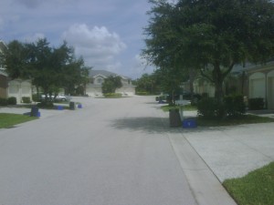
no sidewalks. just asphalt and concrete.

We leave her parents' condo and begin walking down the asphalt towards the gate.

Approaching the gate. You'll notice that the gate only prevents automobile access.
Approaching the gate. You'll notice that the gate only prevents automobile access.

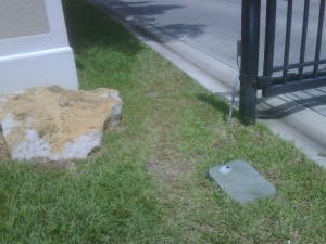
The trampled grass clearly shows the demand for pedestrian access to US 41.

The trampled grass clearly shows the demand for pedestrian access to US 41.

Now, once you make it up to US 41, you’ll find a typical (4 feet wide, plain concrete) residential sidewalk, however it’s set 10 feet from the roadway and slightly below grade. This is done because US 41 is a very wide, high speed county arterial. The majority of the retail within Lee County is on US 41. It’s the epitome of the new suburbs – all land uses carefully divided through Euclidean zoning, accessible only by car.
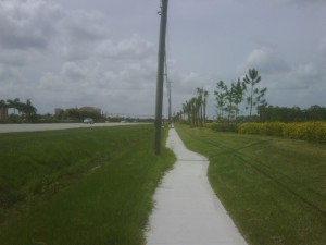
See? We're pedestrian friendly!
See? We're pedestrian friendly!

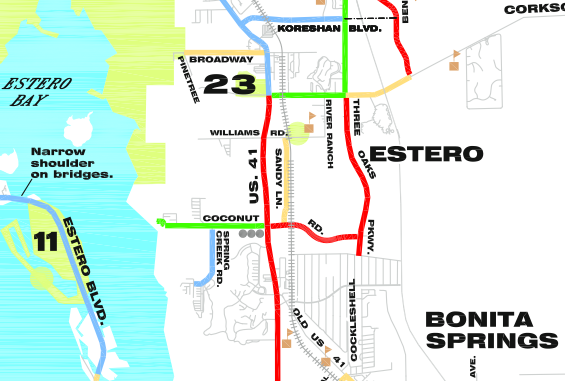
Lee County Bike Map. Red denotes "dual facilities."

Detail of the Lee County Bike Map. Red denotes "dual facilities."

The Lee County Bike Map lists this section of US 41 as having “dual [cycling] facilities,” those being a sidewalk and a paved shoulder.We did pass one person utilizing the sidewalk as a bike path. This was the only other person we saw outside of a car. Cycling makes sense – given the distance between stores and residential developments, using a bike increases your range considerably. Walking two miles (or more) might be considered ridiculous for those with access to a car, however biking two, three, five or miles in Florida can be considered recreation. Encouraging cycling to work, the convenience store, etc. would help Southwest Florida reduce VMT and congestion by getting single-occupancy vehicles off the road. Despite “dual facilities” the physical configuration of the streetscape makes all forms of travel besides the personal automobile seem dangerous and inhospitable. There’s no pedestrian oriented signage, no signal prioritization, no shade or shelter and barely adequate sidewalks and crosswalks.
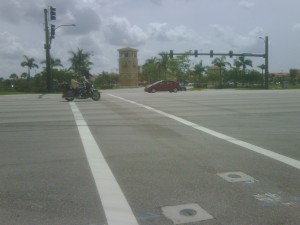
Cross at your own risk. The walk sign lasts about 3 seconds. The walk across at a casual but brisk pace takes around 10 seconds. The curbcuts are ADA accessible, but the timing of the light itself would cause problems for those with physical disabilities.
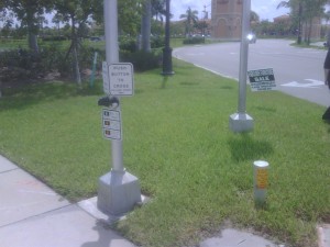
Cross at your own risk. The walk sign lasts about 3 seconds. The walk across at a casual but brisk pace takes around 10 seconds. The curbcuts are ADA accessible, but the timing of the light itself would cause problems for those with physical disabilities.

Once you cross US 41, there's no sidewalk to get into the shopping center. You're walking there? Who walks? What's wrong with you?

Once you cross US 41, there's no sidewalk to get into the shopping center. You're walking there? Who walks? What's wrong with you?

Just like the gated community across the street, this pod of retail development is connected to the world by asphalt and accessed by car. Coconut Point does have a residential component and unfortunately Simon took down the website they had up with a great map and detailed renderings, so I can’t point to you a nice package of evidence that they thought at least some of the project through. The interior walkways throughout the “lifestyle center” are actually pretty nice.
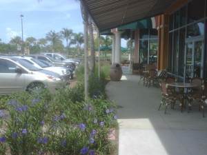
The interior walkways are wide, with a planting strip.

The interior walkways are wide, with a planting strip.

Too bad you cannot easily get to the more friendly pedestrian pathways without a car. The single use pods of commercial residential development set a mile or two apart inhibit easy pedestrian access. The mini-center within Coconut Point is a step in the right direction for future land development in Florida, however considering how much of the area has been built out, it will take serious planning and a change in the collective vision of Southwest Florida before we see true center-based development.

Posted in Cars, Planning, Transportation | Tagged , , , , | 1 Comment

Presentation on OS GIS at MAC URISA

Yesterday, I gave an introduction to open source GIS at MAC URISA. As the meeting was about Internet-enabled GIS, I focused on server-side software. I’ve made the presentation available on SlideShare and available as a download from my website.

Here’s a listing of the programs and standards I reference in the presentation:

Here’s the sites I referenced as examples using open source GIS:

Posted in Events, Technology, Web Mapping | Tagged , , | 1 Comment

Google Latitude now with badge, basic API

Google Latitude has been updated to incorporate new features that make it easier to share your location data. A website badge has been created that shows your most recent position on a web page. You can see an example of the badge showing my current location on this blog’s home page, as well as on the home page of NJ State Atlas. Google has also introduced a basic API allowing you to retrieve your location information as KML or GeoJSON.

Considering someone will likely (ab)use these new features soon, I’m starting a countdown. I’m guessing a week from now we’ll hear about how someone tracked someone unknowingly using a Latitude-enabled mobile device and the API. Personally, I’m hoping the API gets put to good use and is integrated into some groundbreaking projects.

Posted in Google, Google Maps, Privacy | Tagged , | 1 Comment

Steven Johnson giving a brief talk on John Snow’s map

Steven Johnson, author of The Ghost Map, gave a 10 minute talk at TED on the 1854 cholera outbreak in London.

Steven Johnson’s take on the outbreak is an amazing read. If you have just a passing interest in geography or disease control, you’ll enjoy this book.

Posted in Books, Data, Visualization | Tagged , , , , , | Comments Off on Steven Johnson giving a brief talk on John Snow’s map

State Planning hasn’t changed all that much…

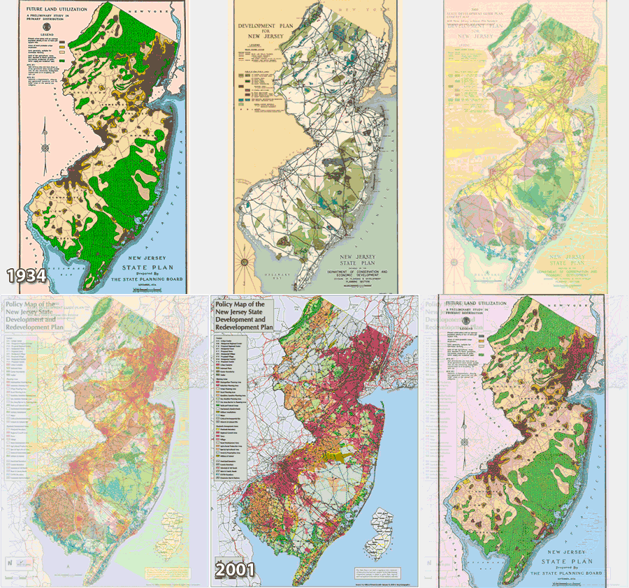
When you look at the maps produced for the NJ State Plans, you can see a not-so-surprising trend.

State Plan maps spanning 70 years.

State Plan maps spanning 70 years.

Encourage development in and around our cities. Preserve areas of environmental importance, such as the Highlands and Pinelands. Plan accordingly for agriculture.

I’m always surprised when environmentalists and developers claim that a proposed plan or regulation will have severe ramifications one way or another. The current course on which we are traveling has been set a long time ago. We still march towards statewide build out, while simultaneously preserving thousands of acres of farmland and open space.

That being said, we still need to plan to ensure that on a micro level to ensure that development is encouraged where appropriate and that the environs protected or reserved for later growth. The 2009 New Jersey State Plan is currently available from the Office of Smart Growth‘s web page for informational purposes only. The public comment period will likely begin in June. However, you don’t have to wait until June to take a look at the draft final plan and map. I’ve also made the draft final map available on NJ State Atlas.

Posted in Government, New Jersey State Atlas, Planning | Tagged , , , | Comments Off on State Planning hasn’t changed all that much…

The Advent of All-knowing Point Maps

Over on MetaFilter today, there is a great post filled with links to interactive maps detailing various aspects of the recession and the eventual rebound in the economy. In looking through these maps, I’m irked by the cartographic conventions employed by some of them. Google Maps has started a dangerous trend: representing everything possible as a point on a map.

For example, take Richard Florida’s “The Shaping of America” interactive map in The Atlantic. The map relies on points of varying size to show the number of patents, the population and income levels for selected US cities. The size and color of the point is an indicator of the city’s performance relative to the surrounding “metro average.” There’s no definition of what these “metro areas” are. They are not delineated on the map. The boundaries of the city are also not reflected.

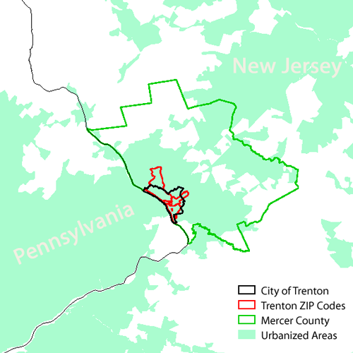
Why is this a problem? While not having the city outlined is concerning, the truly egregious flaw is that the theme of the map is dependent on a ratio without well-defined boundaries. Take, for instance, Trenton, New Jersey. Trenton is slightly north of the geographic center of New Jersey, however it is routinely grouped with “South Jersey” and is rarely grouped in “Central Jersey.” The parts of the State that identify themselves as “Trenton Metro” are limited to adjacent municipalities, if that. So what is the “metro area” of Trenton? Is Princeton included in Trenton? That would absolutely set Trenton above average for all three indicators mapped.

Map depicting a few of the boundaries for Trenton and its Metro Area

Map depicting just a few of the boundaries for Trenton, NJ

Now consider the New York Times Immigration Explorer. The Times has been cranking out some amazing maps lately and this one is no exception. This temporal, thematic map is rendered using Flash. It shows the 3,000 or so counties within the US with great detail and clarity. Ethic groups as a percentage of total population are reflected on a chloropleth map while the overall population is shown using dots of varying size. We’re back to the dot map, but it’s very different from the Google Dot Map above. The dots are sized in proportion to the total population, not an ill-defined sample. Also, the Flash interface allows the user to manipulate the base size of the dots, which allows the user to discern differences in population in the most sparsely inhabited regions.

Immigration Explorer would still convey its intended message if the cartographers behind it employed a dot map like the Shaping of America. Considering the data is explicitly by county, a point map could be used without introducing ambiguity. However, considering the geographies represented by the Shaping of America map are not well-defined, we are left guessing what we’re actually trying to represent with those dots.

Google Maps (and KML, the language for user-defined data in Google Earth) supports lines and polygons. Granted, there are more hoops to jump through to get vector data into Google Maps, but there are ways to do it. Maps that really require representation using polygons should not be constructed using points & Google Maps. Using Google Maps isn’t what’s important. Making sure your map delivers its intended message is essential.

Posted in Google Maps, In the News, Visualization, Web Mapping | Tagged , , , , , | 1 Comment

Introducing Map a Day

Kate and I will be updating mapaday.com with interesting maps and other geographic visualizations. I will make an attempt to update the blog at least once a day. (hence the name)

Check it out. If you come across any interesting maps, please let me know!

Posted in Meta | Comments Off on Introducing Map a Day