
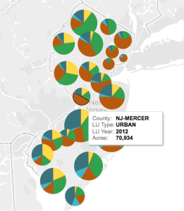
Map of Land Use Categories by County. From the Tableau dashboard.
I was home sick on Wednesday, so while I was on the couch I decided to dive into Tableau Public, a free desktop visualization tool. At IERP, we use Tableau for some of our public dashboards. Other than some minor playing around, I really did not use tool too much prior to this. It’s really great for working with complex data and seeing results quickly. Seeing that the 2012 Land Use data was released a few weeks ago, I wanted to see if I could bring it into PostgreSQL and produce some graphics of how the land use has changed over time.
View the Tableau Dashboard, the code to reproduce the data, and read on.
In order to get the data necessary to make the desired charts in Tableau, I needed a table that has the acreage for each land use type, municipality, and year represented. (A copy of this data is available in the GitHub repository.)
After loading the data into a PostgreSQL database, I used a series of SQL statements to compile statistics for each municipality. From there, I created a table view to bring in descriptive data and exported the result to a CSV for use in Tableau.
Once in Tableau, you can prepare graphs and maps that highlight the change across the data. The trend of development and urban growth at the expense of forest and agriculture continues through 2012, though the rate of development appears to have slowed in the time between 2007 and 2012.
What was really enjoyable about this exercise is that it is, at its core, a problem to be solved using GIS. The data is originally in ESRI-specific formats, but open source software has become a real useful alternative (or complement) to commercial GIS software. This entire process was performed without ArcGIS Desktop. Even if ArcGIS might have made this process simpler or more convenient, a project like this is a worthwhile undertaking as it gives you experience outside of the familiar. If you’ve ever used Excel’s Pivot Tables to make some charts, you should really download Tableau Public and give it a whirl. It’s free, as long as you are okay with sharing your information on a public site. Consider adding it to your analytic and reporting workflow.
Pingback: Using Tableau to visualize land use change | Geo-How-To News