Over on MetaFilter today, there is a great post filled with links to interactive maps detailing various aspects of the recession and the eventual rebound in the economy. In looking through these maps, I’m irked by the cartographic conventions employed by some of them. Google Maps has started a dangerous trend: representing everything possible as a point on a map.
For example, take Richard Florida’s “The Shaping of America” interactive map in The Atlantic. The map relies on points of varying size to show the number of patents, the population and income levels for selected US cities. The size and color of the point is an indicator of the city’s performance relative to the surrounding “metro average.” There’s no definition of what these “metro areas” are. They are not delineated on the map. The boundaries of the city are also not reflected.
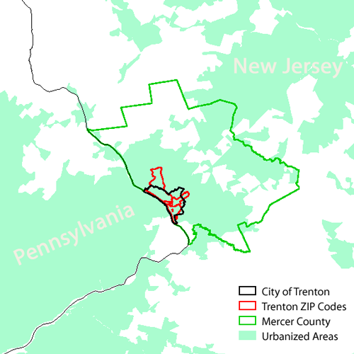
Why is this a problem? While not having the city outlined is concerning, the truly egregious flaw is that the theme of the map is dependent on a ratio without well-defined boundaries. Take, for instance, Trenton, New Jersey. Trenton is slightly north of the geographic center of New Jersey, however it is routinely grouped with “South Jersey” and is rarely grouped in “Central Jersey.” The parts of the State that identify themselves as “Trenton Metro” are limited to adjacent municipalities, if that. So what is the “metro area” of Trenton? Is Princeton included in Trenton? That would absolutely set Trenton above average for all three indicators mapped.

Map depicting just a few of the boundaries for Trenton, NJ
Now consider the New York Times Immigration Explorer. The Times has been cranking out some amazing maps lately and this one is no exception. This temporal, thematic map is rendered using Flash. It shows the 3,000 or so counties within the US with great detail and clarity. Ethic groups as a percentage of total population are reflected on a chloropleth map while the overall population is shown using dots of varying size. We’re back to the dot map, but it’s very different from the Google Dot Map above. The dots are sized in proportion to the total population, not an ill-defined sample. Also, the Flash interface allows the user to manipulate the base size of the dots, which allows the user to discern differences in population in the most sparsely inhabited regions.
Immigration Explorer would still convey its intended message if the cartographers behind it employed a dot map like the Shaping of America. Considering the data is explicitly by county, a point map could be used without introducing ambiguity. However, considering the geographies represented by the Shaping of America map are not well-defined, we are left guessing what we’re actually trying to represent with those dots.
Google Maps (and KML, the language for user-defined data in Google Earth) supports lines and polygons. Granted, there are more hoops to jump through to get vector data into Google Maps, but there are ways to do it. Maps that really require representation using polygons should not be constructed using points & Google Maps. Using Google Maps isn’t what’s important. Making sure your map delivers its intended message is essential.

Good to see you are still working with GIS John. You always were the smartest guy in class! Congrats on your continued success in the field.